
 Last week we talked about Snowberry’s exterior design and paint colors.
Which brings us to the interior color scheme.
A word about home style and cohesion. For me, the exterior and interior of a house should bear some resemblance to one another. What I mean by that is the exterior theme and interior style should flow; should be cohesive … what you see on the exterior should offer some indication of what you’ll find inside.
Snowberry is a 1950’s ranch style house with a little bit of Cape Cod flair. The cedar shake exterior is traditional in style therefore the interior is as well. For those who think tradition = boring. I beg to differ. We’re not talking Grandma’s house here. Snowberry is what I like to call modern cottage or modern traditional. Traditional, but with a modern twist.


Exterior and interior cohesion is a real bee in my bonnet and probably worthy of its own blog post, so … stay tuned.
Ok, with that said, let’s get to the paint colors.
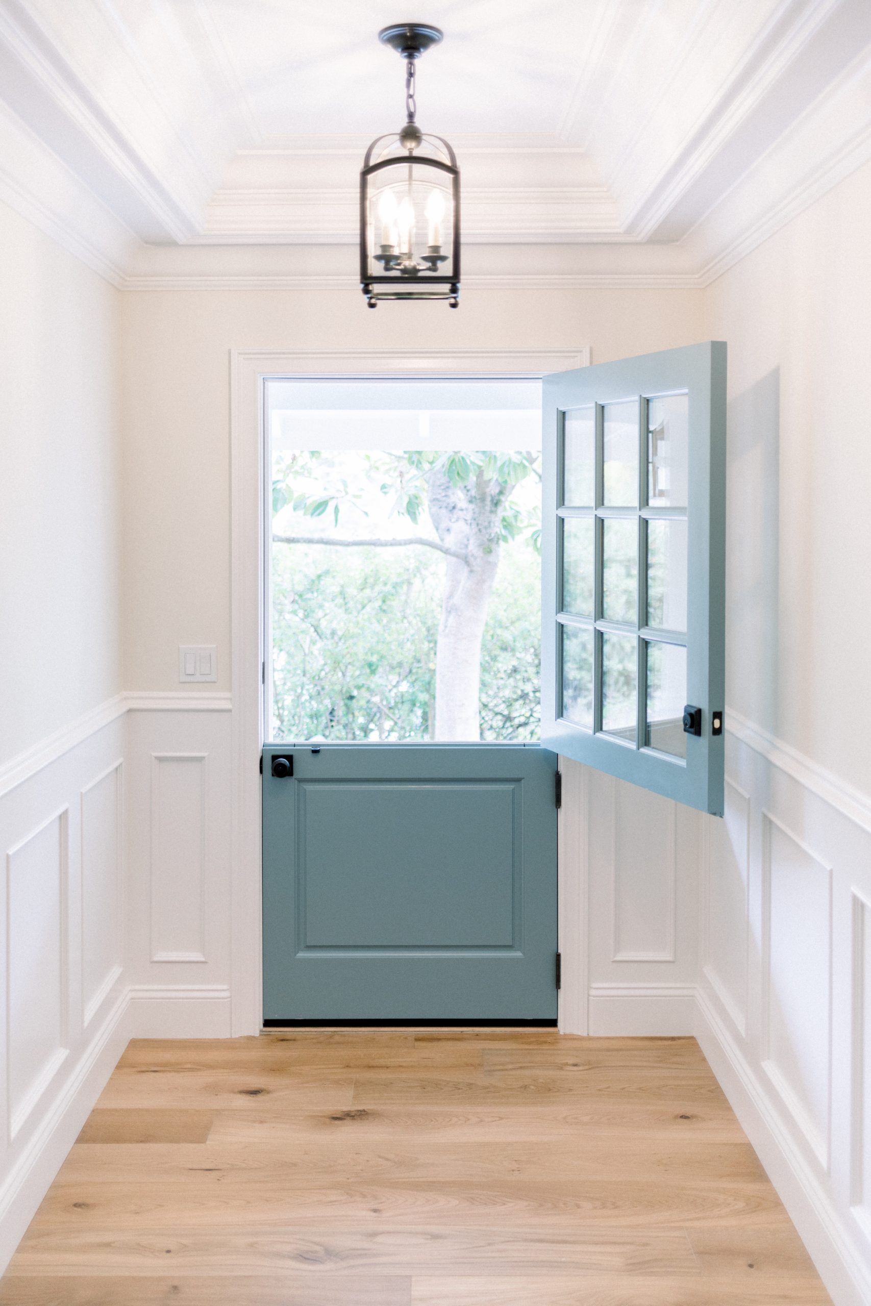
As you come through Snowberry’s front door and enter the small foyer, the library is visible straight ahead. Also from the foyer you get a glimpse into the kitchen on the right and the center hallway on the left.
With that in mind, these rooms, as well as the molding/trim color for the entire house, are first up for paint color selection.
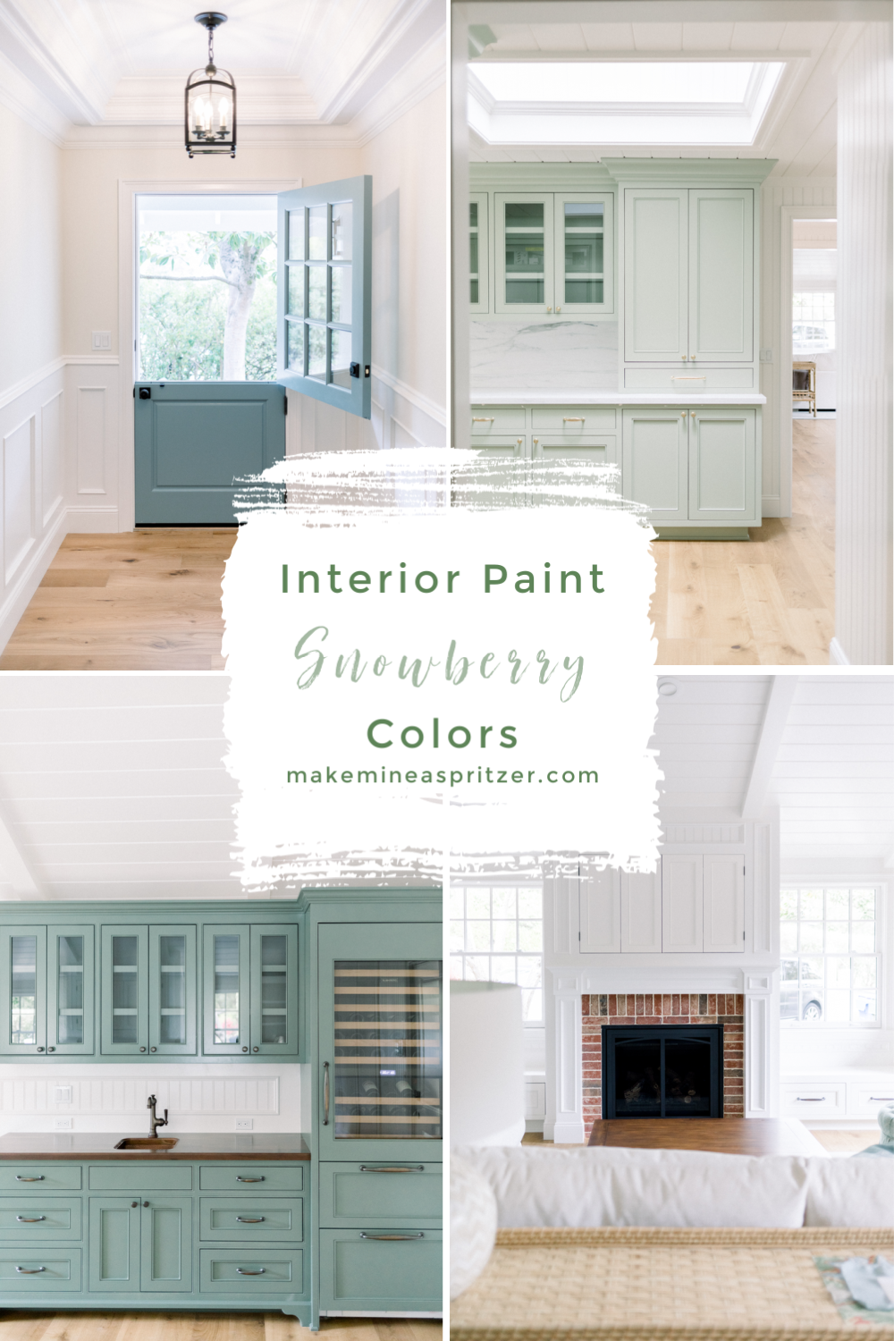
I knew I wanted a blue front door and sage kitchen cabinets. You can read all about Snowberry’s inspiration here. Searching Pinterest and Instagram I was able to determine the paint colors of many of my inspiration rooms, but how would they work together? How to create a cohesive whole house paint color plan?
Good questions … to which there are many answers. I called for help.
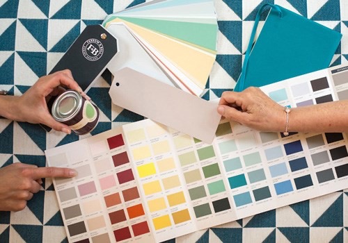
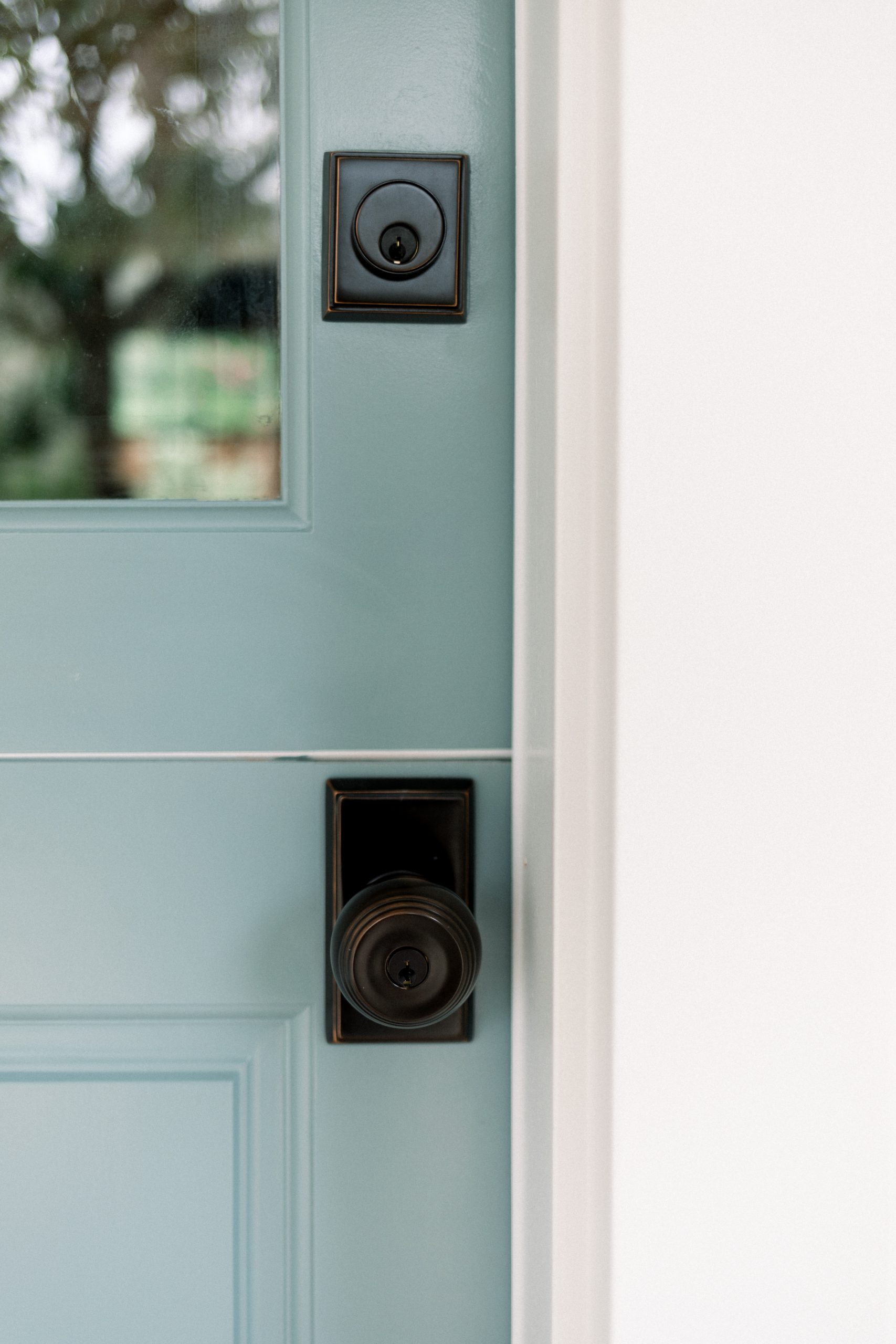
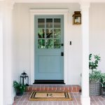
Having already chosen Farrow & Ball Oval Room Blue for the front door, I searched their website for complimentary colors and noticed they offered Color Consultations. Their website says a consultancy will create a ‘curated color palette for your home.’ Farrow & Ball has a reputation for being pricey, but I was curious – and overwhelmed by so many color options and ideas – so I inquired about a consultation.
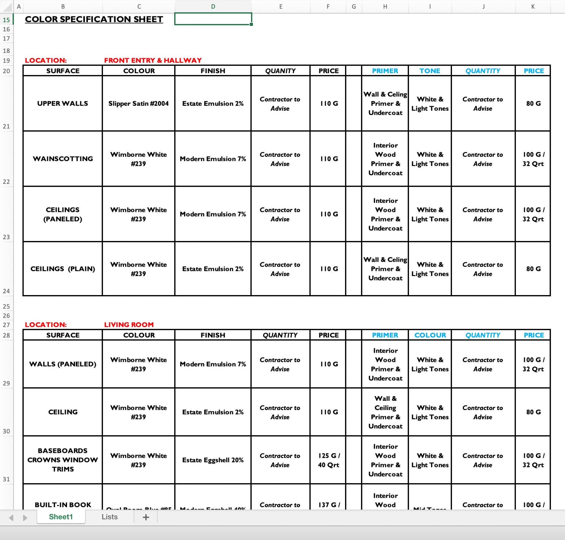
Turns out an in-home color consultation is $250 which is credited back toward the future purchase of paint. The fee includes an in-home visit, followed up with a detailed Color Specification sheet (paint schedule). This includes your recommend paint colors, a large swatch of each color and the appropriate finish recommendations for each application.
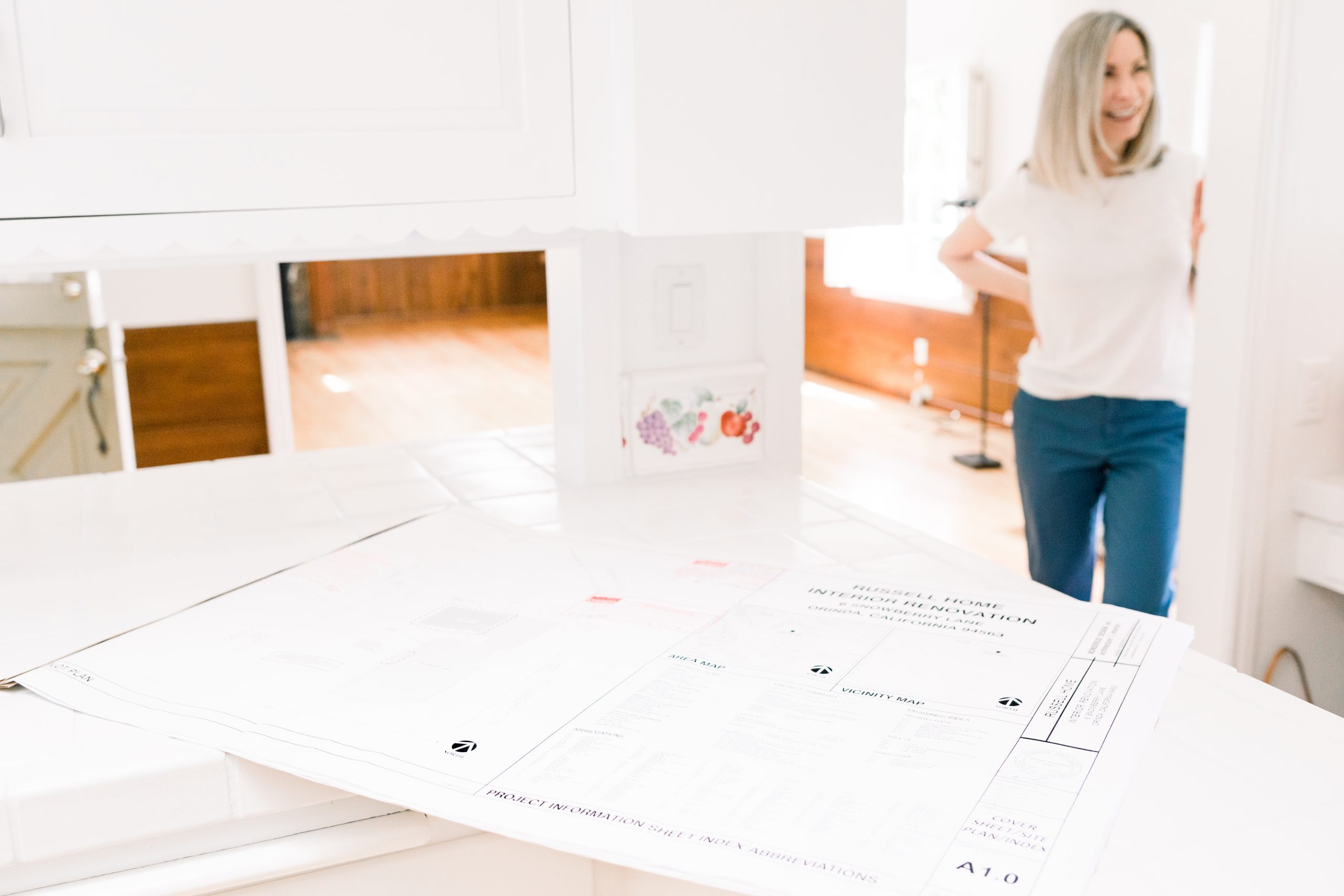
I decided to invest in a consultation. After emailing back and forth, color expert Jet Marie Patterson arrived at Snowberry. We walked the house, in its demolished state, looked through my inspiration binder and discussed my vision for the look and feel of the finished house.
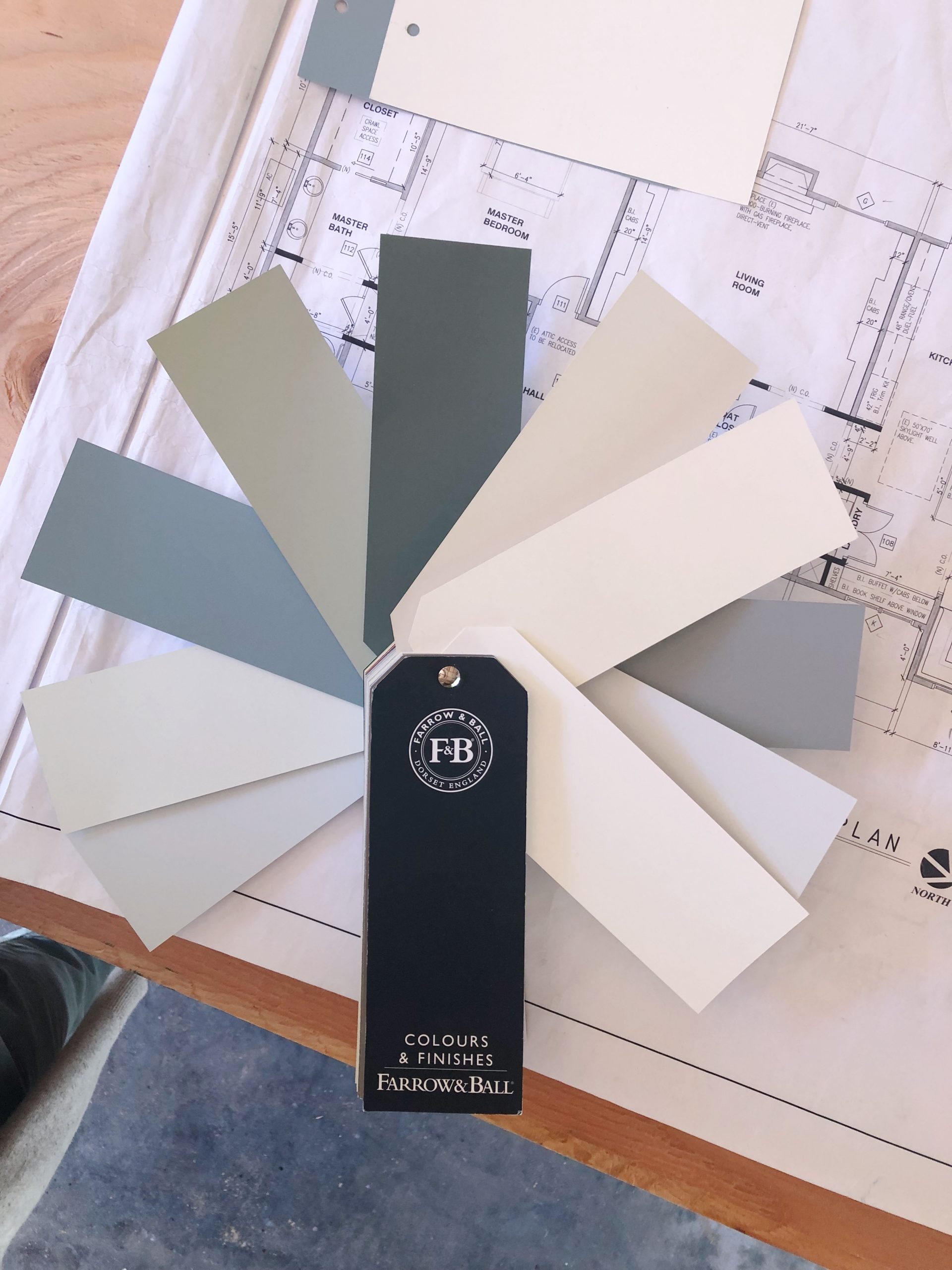
Snowberry’s Color Palette
Jet agreed that Oval Room Blue was an ideal color for the front door.
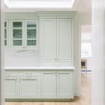
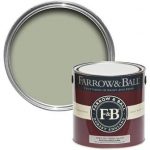
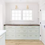
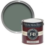
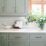
She loved the idea of sage kitchen cabinetry and recommended Farrow & Ball’s Vert de Terre. Oh my gosh, Vert de Terre and Oval Room Blue work so beautifully together … which led to Jet’s next suggestion for the library.
The library renovation plan called for floor to ceiling cabinetry, bookshelves and millwork. No visible drywall. The room has very little natural light and I initially thought it should be painted white. But, with the kitchen, dining and great rooms paneled in white beadboard, a white library seemed a bit too much. I love the look richly painted library room and had saved many inspiration ideas in rich blue and green hues.
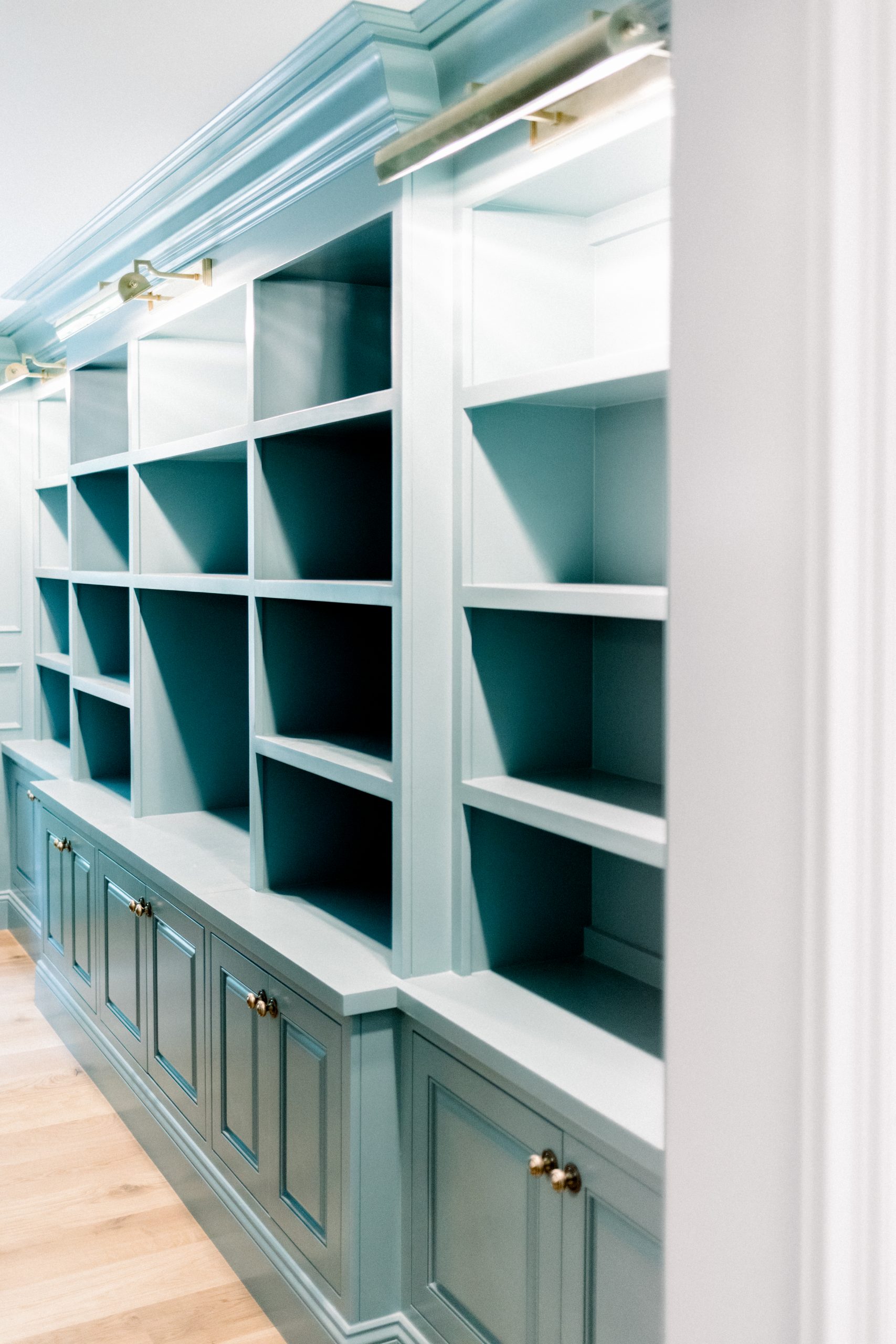
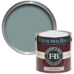
Jet took one look at my inspiration photos and suggested Oval Room Blue for the library as well. Opening the Oval Room Blue front door and looking directly into the Oval Room Blue library with a glimpse of Vert de Terre in the kitchen to the right created a beautiful vision. I was sold.
-

- Farrow & Ball Oval Room Blue
Next up, the foyer, hallway and millwork throughout the kitchen, dining and great room spaces.
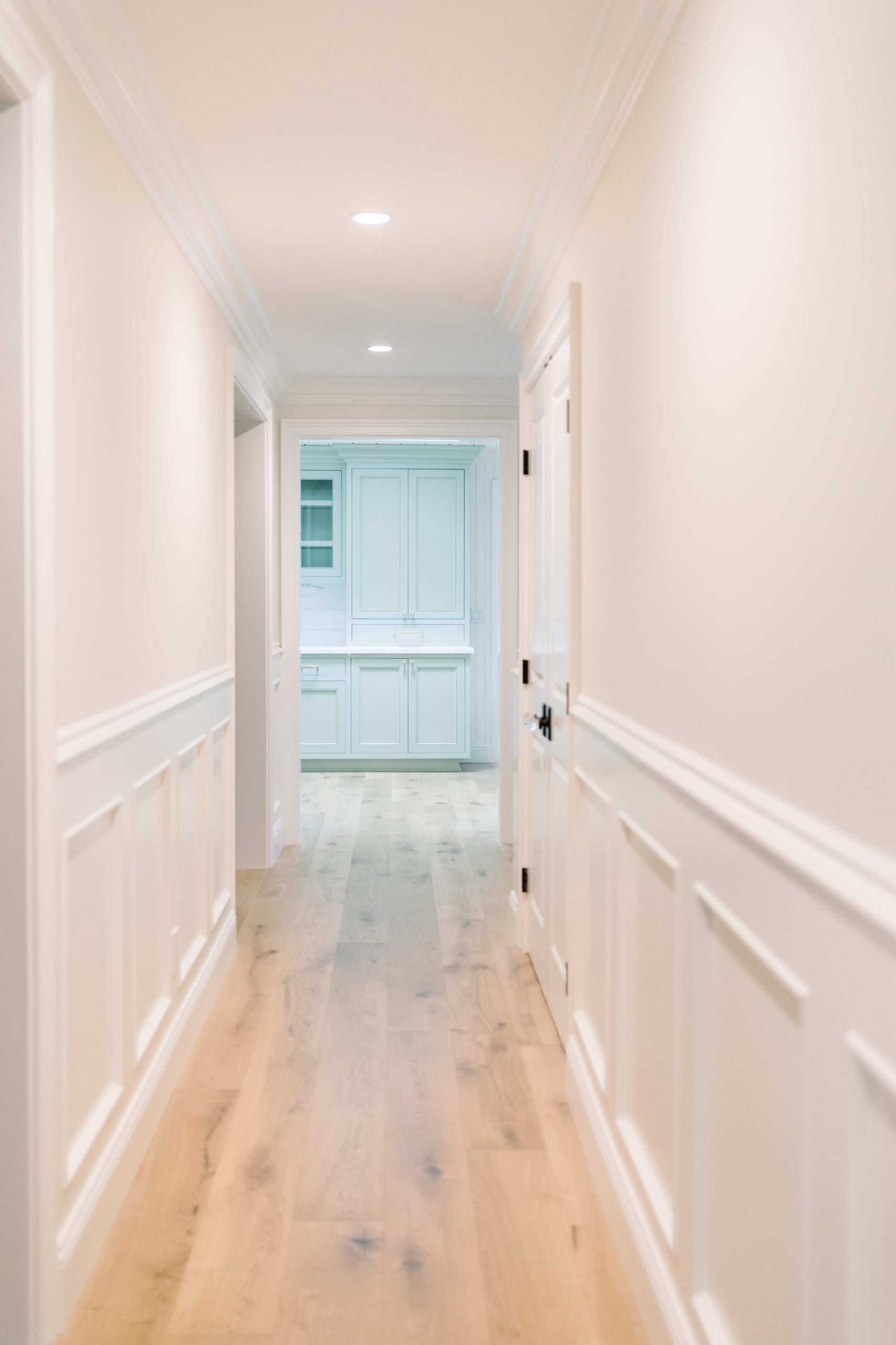
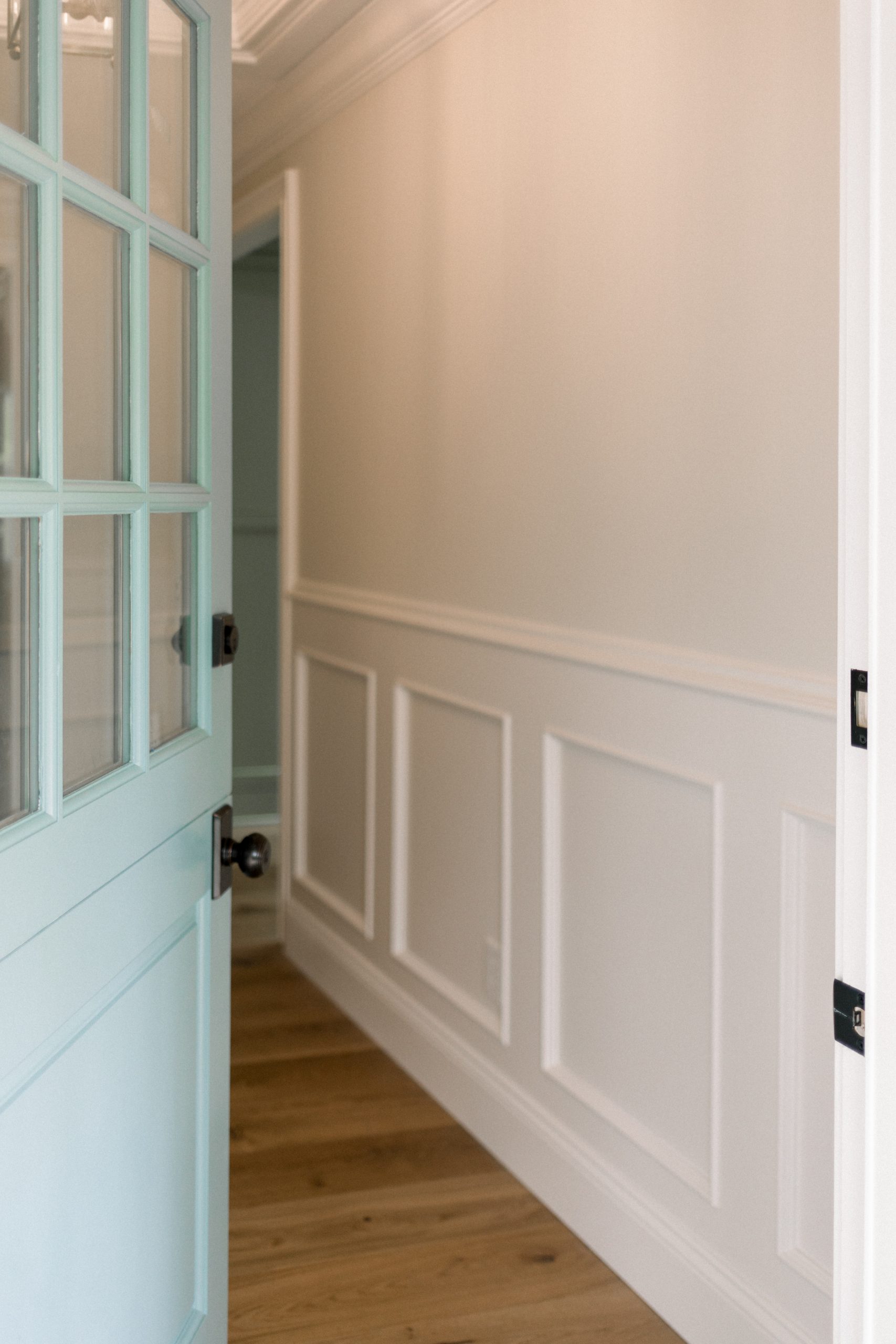
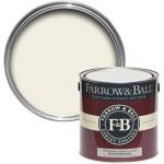
The lower walls in the foyer and hallway received a beautiful wainscot treatment. The upper walls – between the wainscot and crown – are drywalled in a smooth finish. These spaces don’t have great natural light and the hallway is narrow. I wanted them to feel light and airy and create the illusion of spaciousness. Jet suggested Slipper Satin for the upper walls and Wimborne White for the wainscot and trim. Wimborne White was also designated for the moldings and trim throughout the house.
-
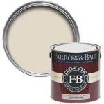
- FB Wimborne White
-
- FB Slipper Satin
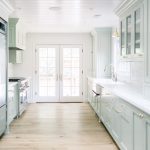
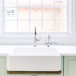
Kitchen / Dining / Great Room
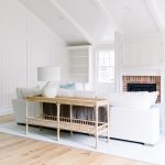
Snowberry’s kitchen, dining room and great room run together … not in an open-concept sort of way … more like connecting train cars. You can see the before and after floor plans here. Therefore, the beadboard treatment I planned for the great room walls was also needed in the dining room and kitchen. This is the type of mission creep situation everyone warns you about pre-renovation. Wimborne White, already determined for the trim, would be used for the walls and ceilings throughout these three spaces.
-
- Kitchen
-
- Dining
-
- Great Room
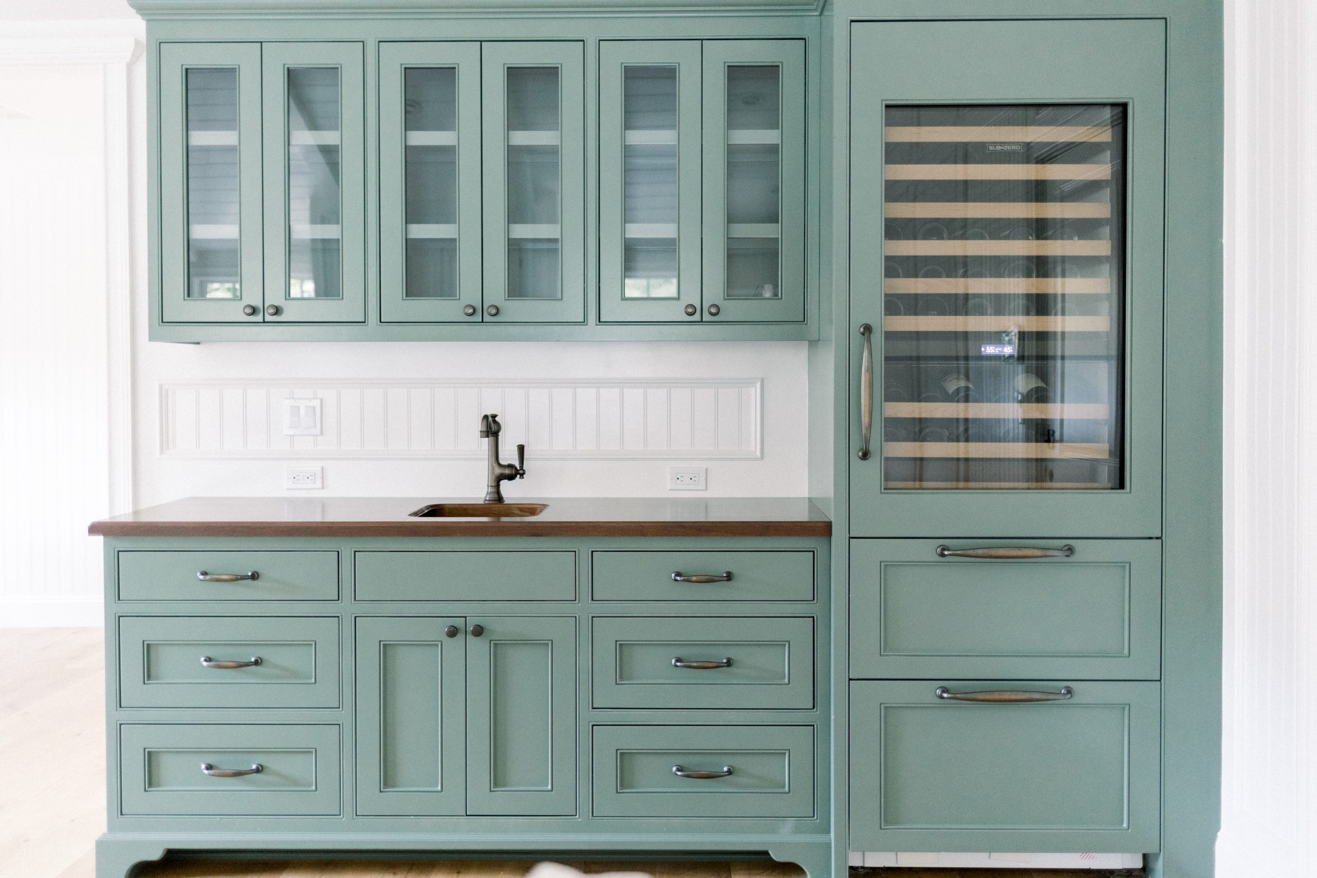
The final paint color decision – for the living-space side of the house – was the great room beverage bar cabinetry. I had my heart set on a wood countertop for the bar. I pictured it in a dark walnut. My husband, Jim, wasn’t on board and considered the bar his domain and not open for discussion. This is a battle discussion we had about our last two houses and in both cases I lost. He must have grown tired of revisiting the issue and he gave in agreed it was the way to go at Snowberry. Once again mission creep reared its ugly head and walnut countertops were installed on the beverage bar AND the kitchen buffet and laundry closet counters as well.
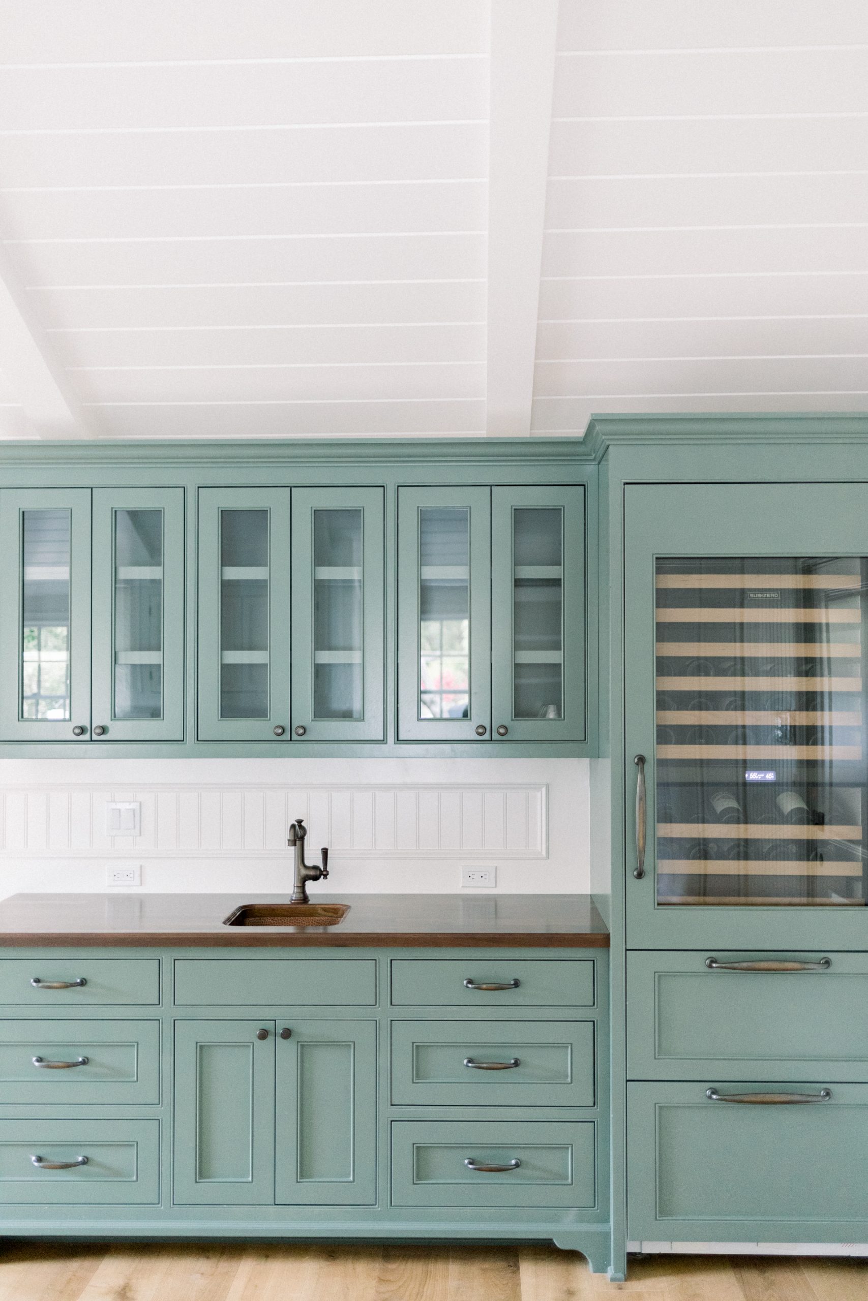
Back to the beverage bar cabinet color. I considered using the kitchen cabinet color, Vert de Terre. But felt that the bar should differentiate itself from the kitchen and deserved its own color. Jet suggested Green Smoke … a hunter greenish color … which pairs beautifully with the walnut.
And, there you have it.
I’m a quick decision maker. I either love it or I don’t.
In about an hour our whole house color scheme was decided.
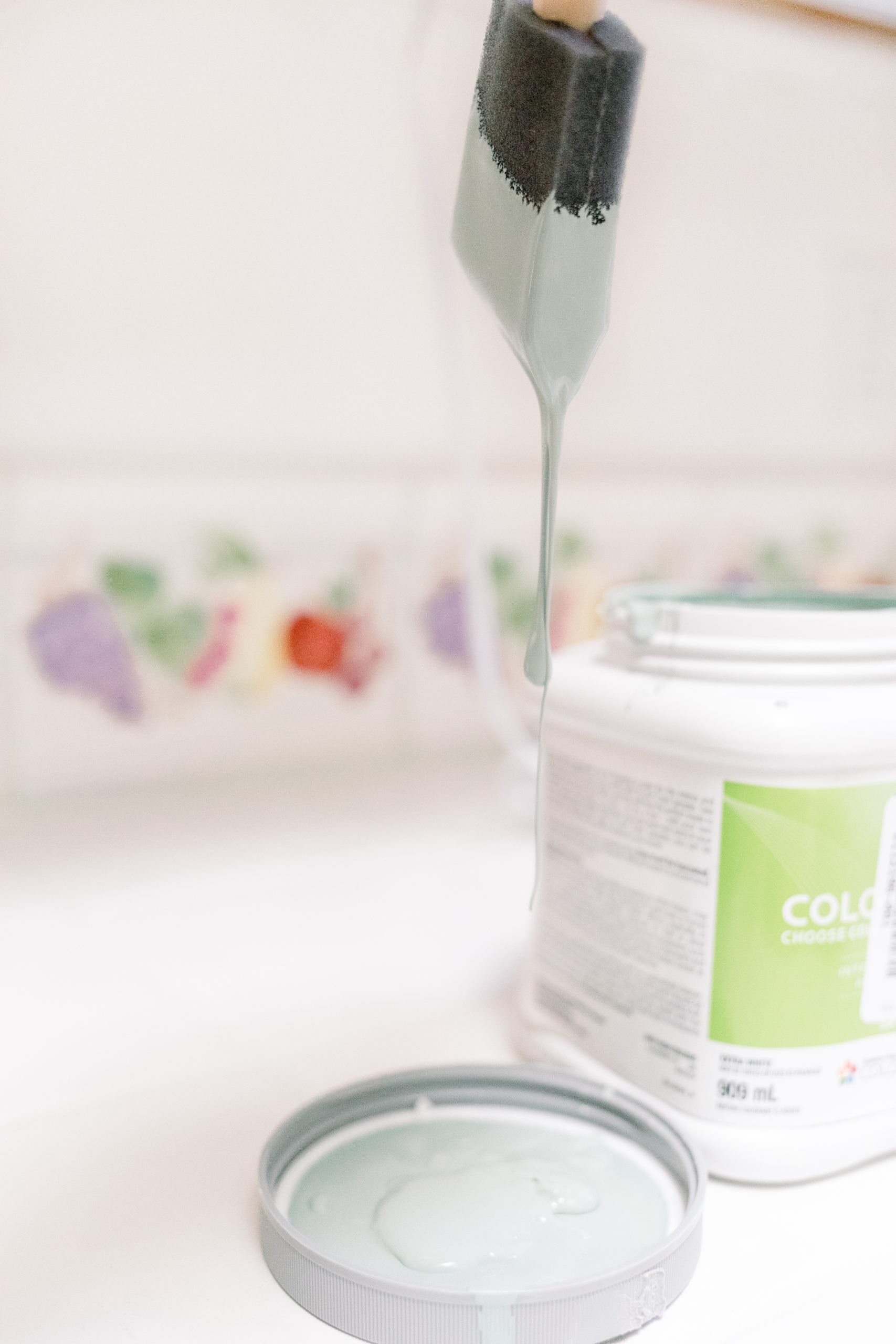
A few days later I received an email from Jet with the paint schedule attached. A few days after that a fancy envelope arrived via snail mail containing the paint schedule in hard copy, large paint swatches, a gift card. Let me tell you, it was beautifully packaged and presented … the paint schedule printed on super high-end paper stock, the paint swatches tied with a pretty bow … I mean, ooh la la … nicely done.
Important Mentions
When it was time to paint – months later – I felt the Wimborne white wasn’t quite right for the wainscot, trim and moldings. I switched it out for Benjamin Moore White Opulence, a brighter white that worked well with the Farrow & Ball colors and was more in keeping with the light and airy space I envisioned.
BM White Opulence
Full Disclosure – we did not buy our paint from Farrow & Ball. The cost was substantially higher – I mean SUBSTANTIALLY – than our painting contractors preferred Benjamin Moore Aura paint. I can’t speak on the difference in Farrow & Ball’s product that justifies its cost. When I saw their quote and compared it to the Benjamin Moore quote no further discussion was required.
Most paint brands offer some form of in-store color consultation as well as online tools. Of course, in-store assistance is always available at no cost – including at Farrow & Ball locations. Our closest Benjamin Moore store has local interior designers on-site certain hours each week. The designers will also come to your home for a consultation and, like Farrow & Ball, charge a fee for this service.
Let’s review the paint choices:
- Front door – Farrow & Ball Oval Room Blue No.85
- Foyer & Hallway upper walls – Farrow & Ball Slipper Satin No.2004
- Foyer & Hallway lower wall millwork – Benjamin Moore White Opulence OC-69
- Library – Farrow & Ball Oval Room Blue No.85
- Kitchen cabinetry – Farrow & Ball Vert de Terre No.234
- Kitchen, Dining & Great Room beadboard walls – Benjamin Moore White Opulence Oc-69
- Beverage Bar cabinetry – Farrow & Ball Green Smoke No.47
- Wainscot, molding, trim and ceilings – Benjamin Moore White Opulence OC-69
Paint finishes – Walls & Ceilings (drywall) = flat finish. Moldings & trim = satin finish. Our cabinetry was painted by our cabinet maker in his shop.
-
- FB Wimborne White
-
- FB Slipper Satin
-
- Farrow & Ball Oval Room Blue
-
- FB Green Smoke
Bottom line … was the color consultation worth the money? (Remember, we did not buy our paint from Farrow & Ball so the $250 fee was money out of pocket.)
The answer is … YES!
Yes, it was absolutely worth it, and I would do it again in a heartbeat.
Next time we’ll pick up where we left off and talk through the paint colors in Snowberry’s bedrooms and bathrooms. Who knew Snowberry’s color scheme would require three full blog posts? Maybe I’m long-winded.
Also, next week I’ll be offering a free printable of Snowberry’s entire color scheme – The Paint Colors of Snowberry!


As always, I appreciate your visit and would love to hear your thoughts in the comments below.


Reader Interactions