
It’s time to tackle the paint colors in Snowberry’s bedrooms and bathrooms. To recap, we’ve talked about how I chose Snowberry’s exterior design and paint colors, as well as the interior paint colors throughout the main living spaces. We’re on the home stretch.
Snowberry’s bedrooms and bathrooms are on one side of the house, to the left of the foyer. You can see the floor plan in my post, Snowberry Before the Renovation.
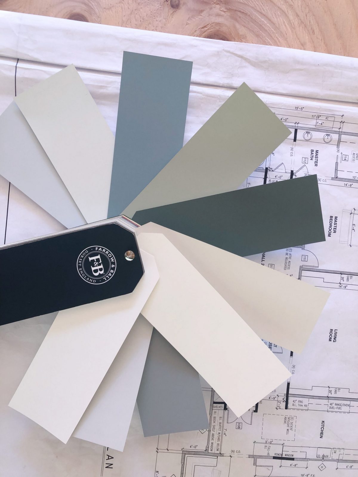
In my last post I shared my experience working with a paint color consultant from Farrow & Ball, Jet Marie Patterson.
For the most part I stuck with Jet’s recommendations.
Snowberry’s Color Palette
But, in the bedrooms and bathrooms, I went rogue.
First of all, during a renovation you spend an inordinate amount of timing planning and envisioning the finished house … all while the actual house is torn apart. Many people – interior designers, contractors and other creative folks – can look past the exposed studs and see the finished space. I am not one of them.
By the time the drywall went up and I began to have a glimmer of clue what the finished rooms might be … I started to hedge on some of my paint choices.
But, I’m getting ahead of myself.
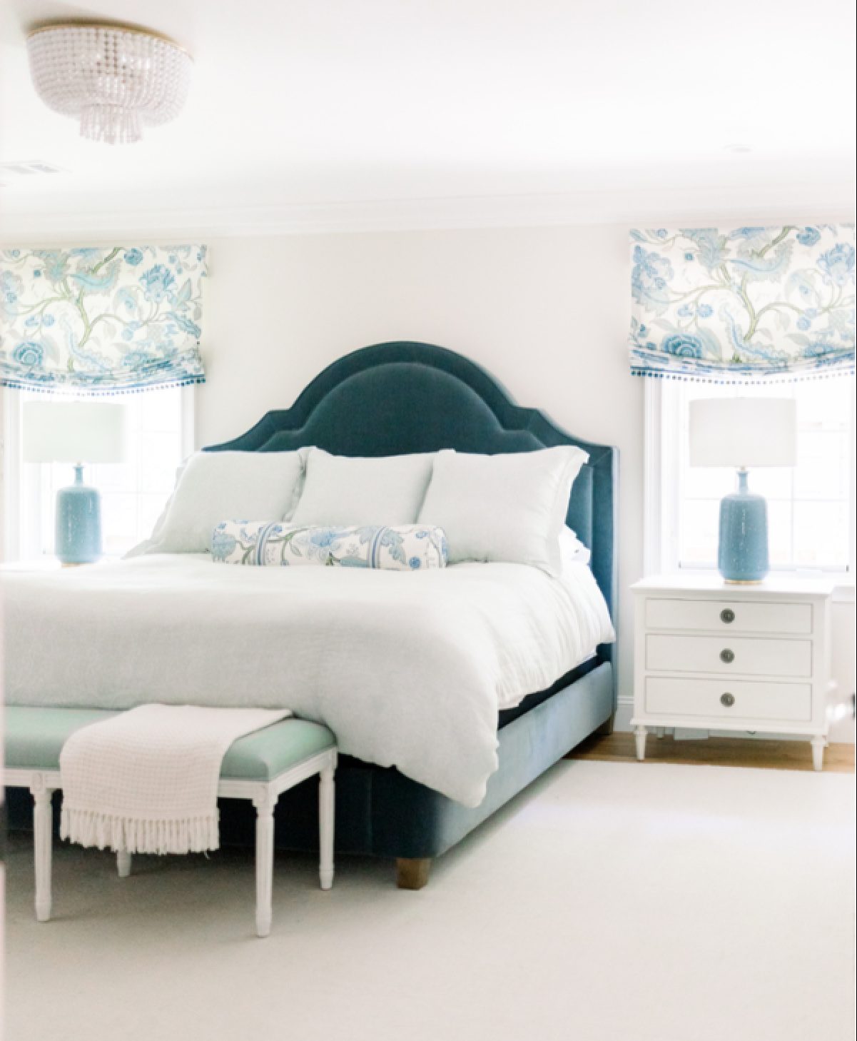
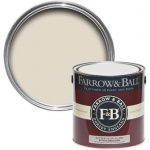
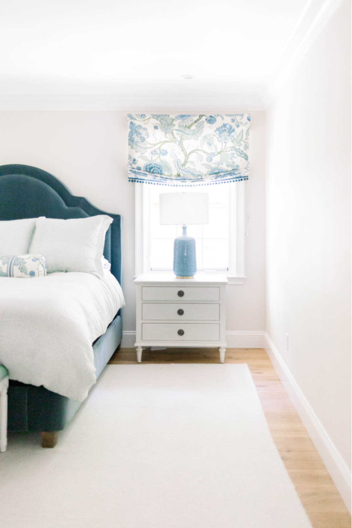
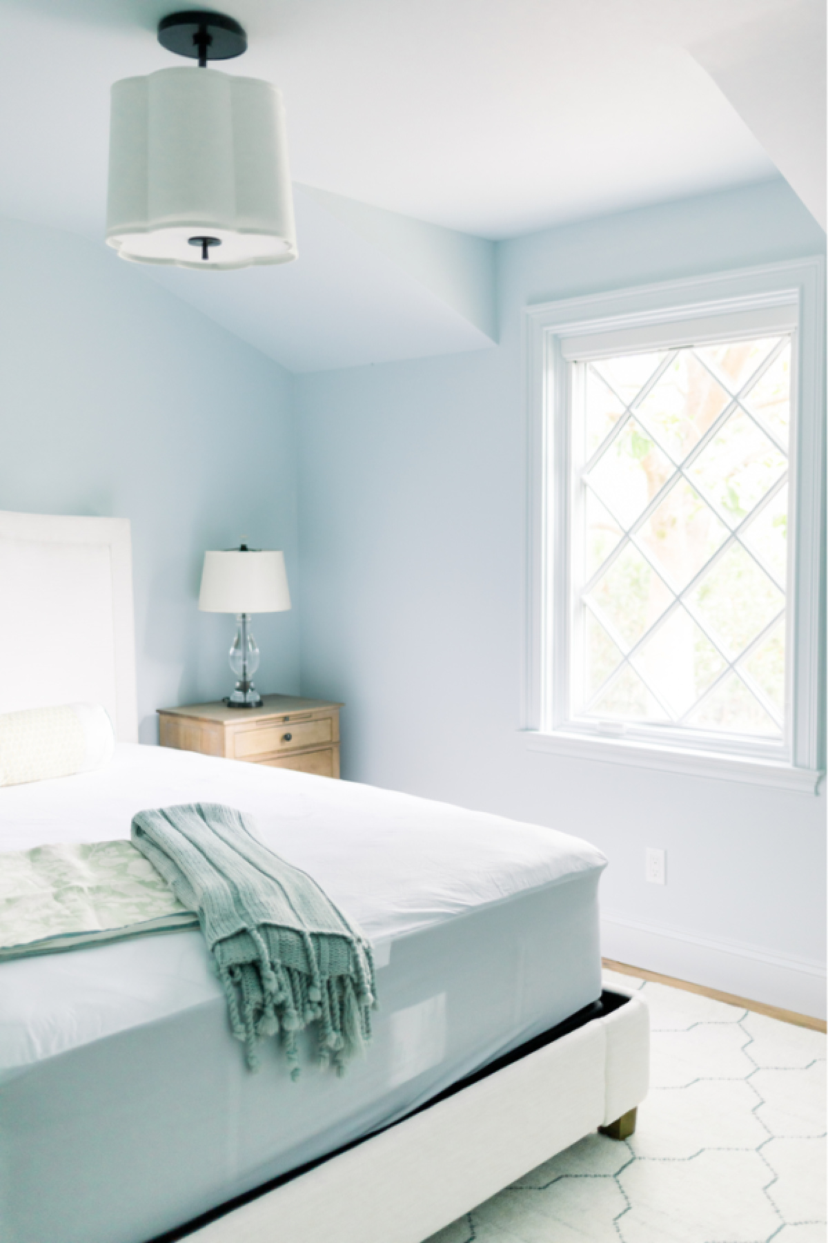
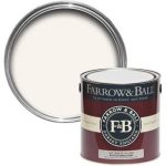
Let’s set the scene. The hallway leading to the bedrooms and bathrooms is painted in Farrow & Ball Slipper Satin (upper walls) and Benjamin Moore White Opulence (wainscot and trim).
-

- FB Slipper Satin
-
- BM White Opulence
With that in mind, let’s take a look at the rest of my paint color choices.
Master Bedroom, Bathroom & Closet
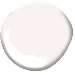
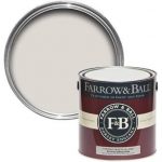
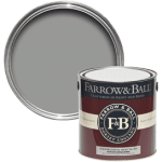
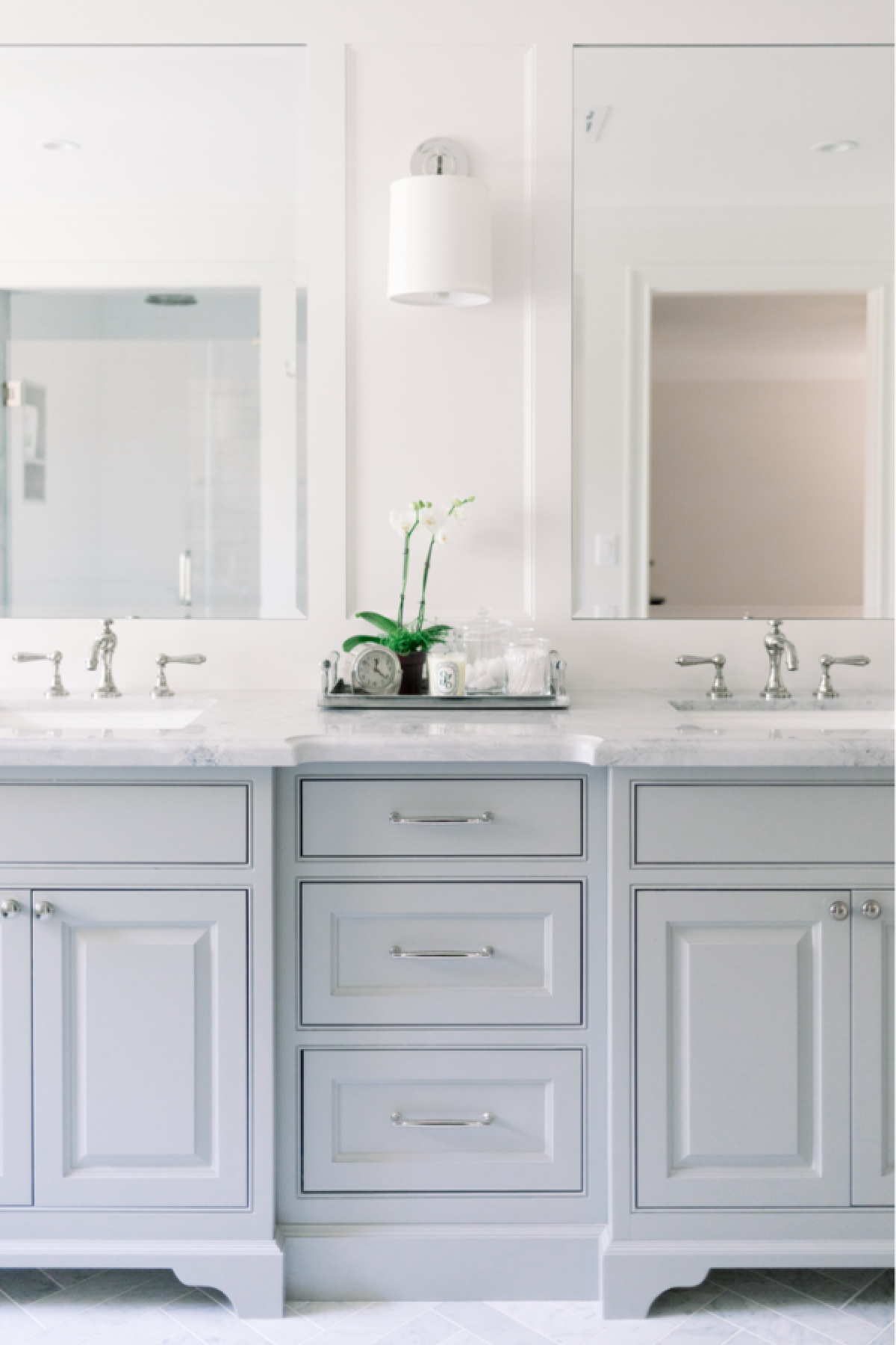
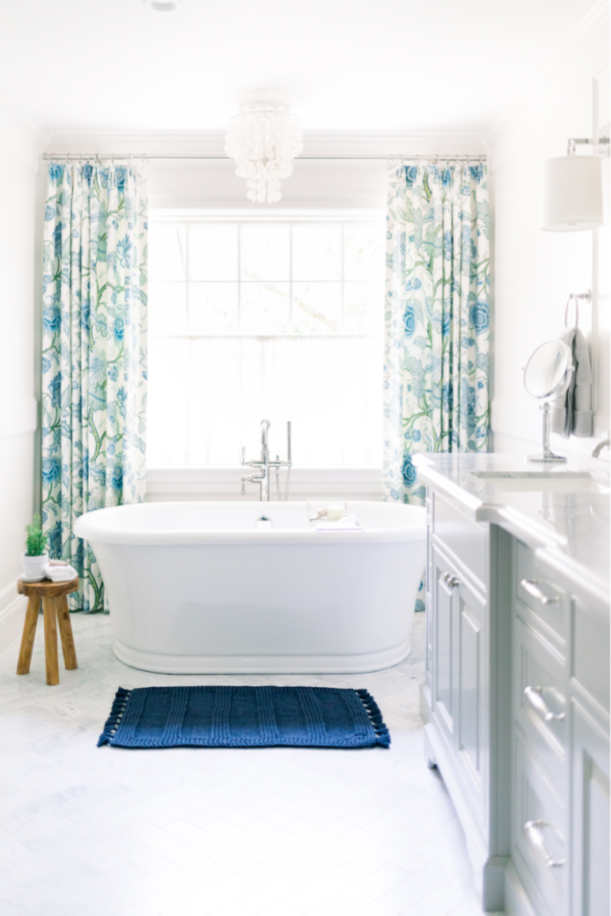
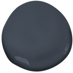
Jet recommended Strong White for the walls and All White for the ceilings and trim throughout the master suite … bedroom, bathroom and closet. These recommendations were based around my desire for a gray bathroom vanity … Manor House Gray.
-
- FB Strong White
-
- FB All White

-
- FB Manor House Gray
Master Bedroom
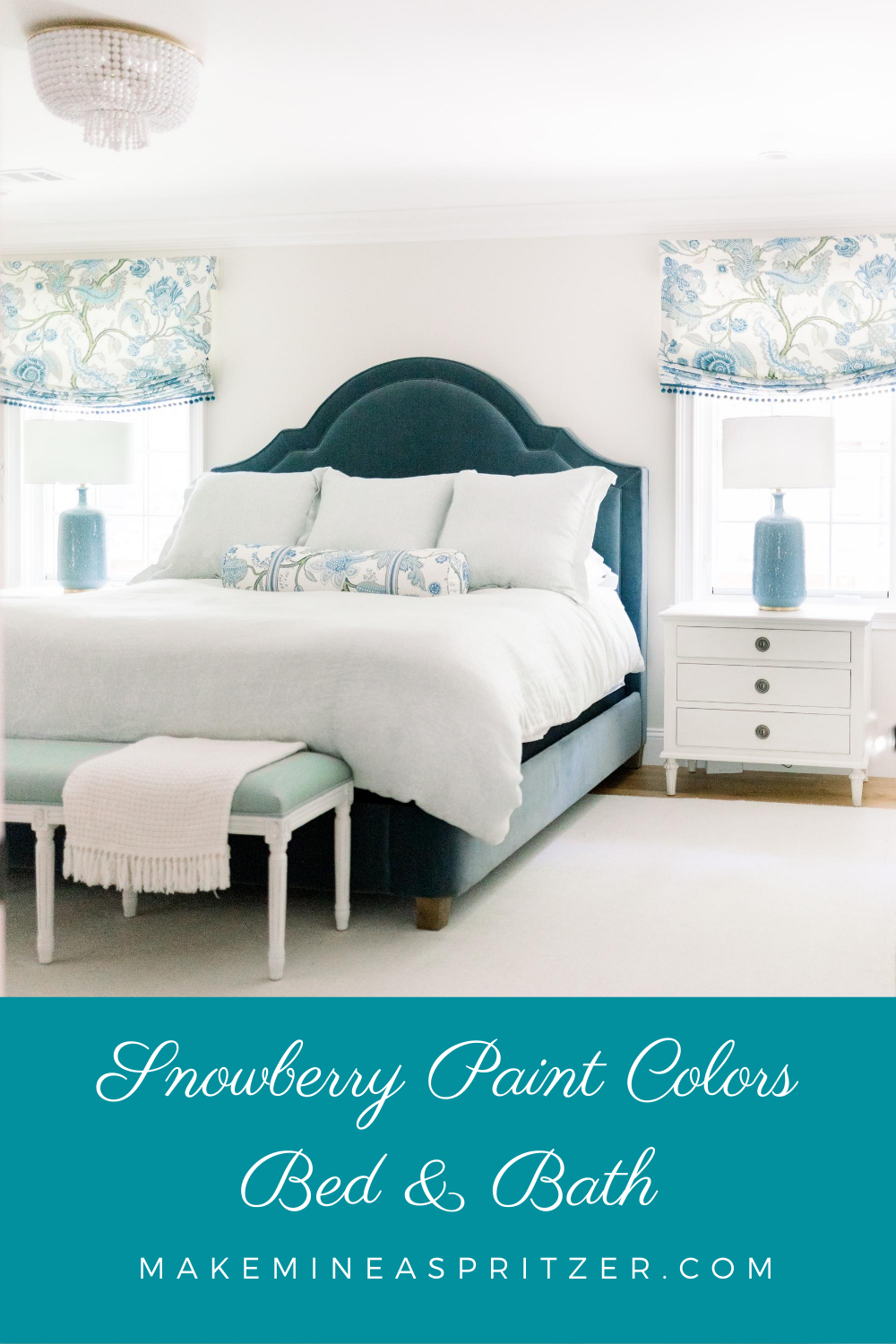
By the time we were ready to paint, I’d made furniture and fabric choices for the bedroom … in a blue and green palette (surprise). Jet’s recommendation of Strong White read too gray for me. A bit cold. I loved the Slipper Satin in the hallway, a softer, warmer color, and made the executive decision to carry it into the bedroom walls using Benjamin Moore White Opulence for the ceiling and trim.
Master Bathroom
My inspiration bathroom included a gray vanity, and Jet recommended Manor House Gray. For the walls she suggested Strong White with All White on the ceiling and trim.
Despite the changes I made to the bedroom colors, I decided to stick with Jet’s plan for the bathroom.
Master Closet
We carried the bathroom wall, ceiling and trim colors into the master closet.


Guest Rooms
Snowberry has two guest rooms. Neither room is large and we removed a window from each room, leaving just one window per room.
A word about windows. Normally one does not remove windows. One adds windows.
But, that’s a story for another day and you’ll have to trust me on this.
Also, both rooms have false gables in the roof creating a down slope in the ceiling over the windows. This makes the rooms feel very cozy (ahem … a bit small). In other words, these are not large rooms with an abundance of natural light. You get the picture?
One day, Mary Ann from Classic Casual Home was here working with me on draperies and throw pillows. She suggested I consider painting each guest room – trim and all – in a single color (in other words, no contrasting trim) . I nodded politely and pretended I got the concept … but the truth is I thought it sounded weird. A short time later, I saw a magazine feature where several rooms were painted one color. It. Was. Fabulous.
Fully onboard with Mary Ann’s idea, I relayed the one-color directive to our painting contractor who raised his eyes brows. But, who having worked with enough crazy homeowners, knew better than to put up much of a fuss. It was more of an ‘okay, it’s your house’ sort of look.
To clarify this one-paint-color technique (my term, I have no idea what it’s called), everything in the room – walls, ceilings, trim, doors – everything – is painted the same color. The only differentiation is the paint finish. In our case the walls and ceilings are a flat finish and the trim is a satin finish.
Guest Room #1
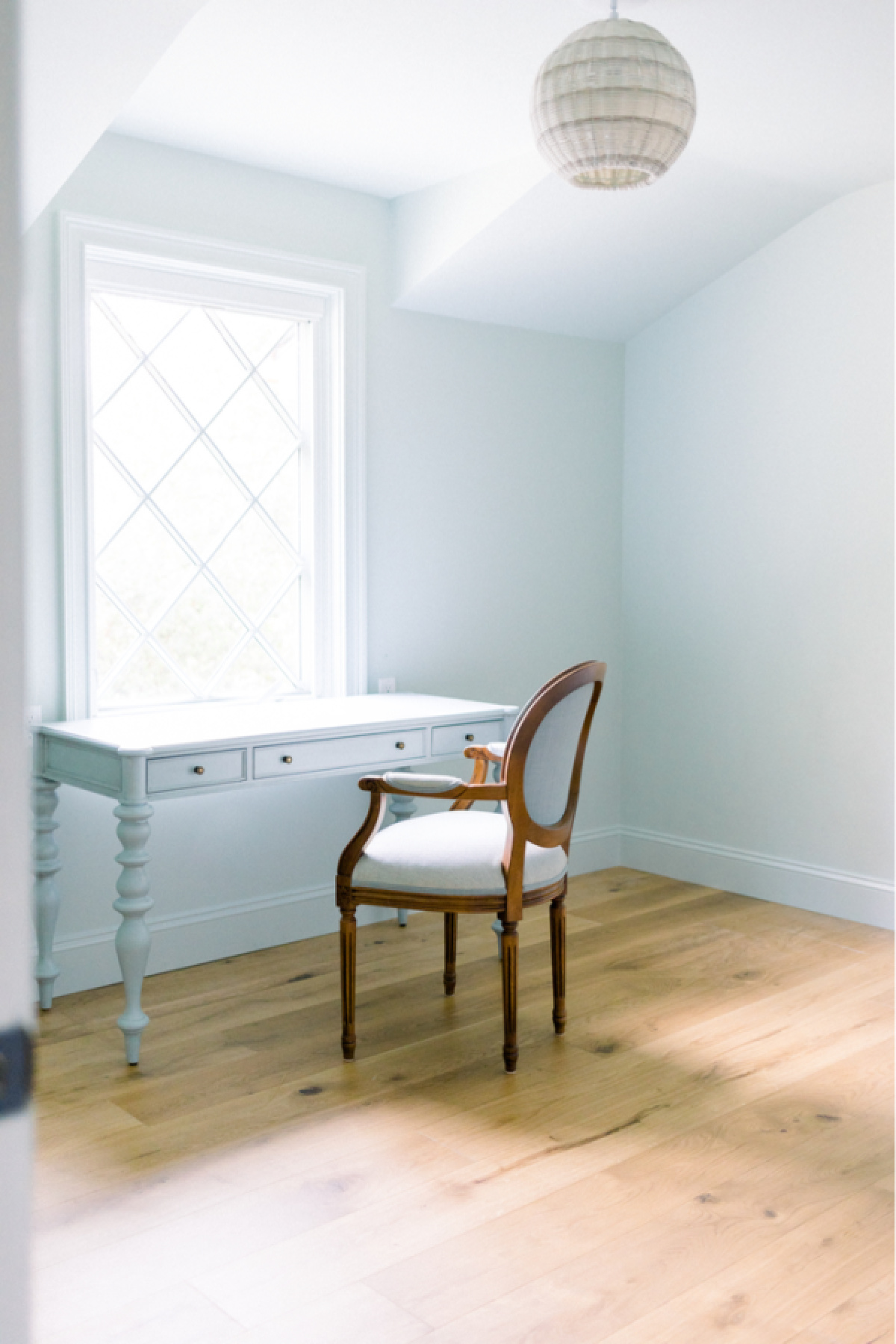
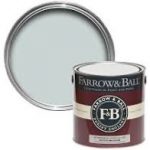
The larger of the two guest rooms contains a queen size bed. I saved, from a previous home, beautiful, custom made pillows in shades of pale blue, green and ivory. I hoped to use them in this room and after Jet saw my photos, she suggested Borrowed Light. A very light and subtle shade of blue.
Guest Room #2
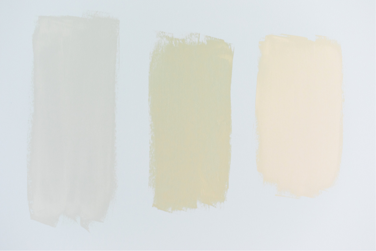
Slightly smaller in size, the plan for this room is two twin beds with a nightstand under the window between them. Aside from layout, I had no color scheme in mind. I want the room to feel comfortable for little boy and girl grands, as well as adults, … so nothing too girly, too boyish or too childish. Jet suggested Pavilion Blue. It looked more green to me … but it fit with the overall color scheme so, why not?
Then the room got painted … and, yikes! It looked more like mint chocolate chip ice cream minus the chips. Ummm …. no.
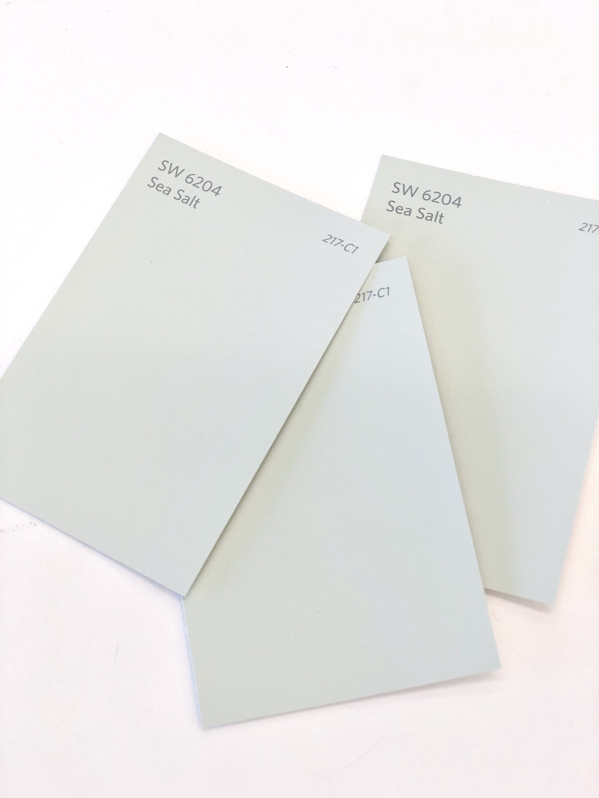
I went back to the drawing board. The first thought that came to mind – Sea Salt by Sherwin Williams. A lovely pale green/gray that I regretted not using in our Fidalgo Island home. I drove to Sherwin Williams, picked up a paint chip, tossed it on top of our other paint chips and, voila! Perfection. Room repainted Sea Salt.
The moral of the story? Seek advice from professionals and experts, but always defer to your own judgement.
Come to think of it, this applies to all things in life. Not just paint colors. Trust your gut.
Guest Bath
Now for the coup de gras … Snowberry’s teeny tiny guest bathroom.
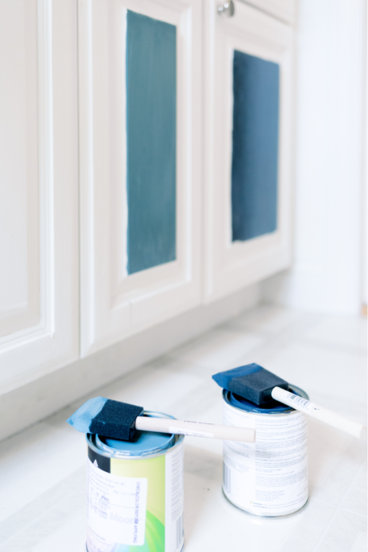
Three words … Hale Navy, baby.

BM Hale Navy
That, and Schumacher Pyne Hollyhock wallpaper.

Schumacher Pyne Hollyhock
Before I picked a single paint color, before there was an architectural plan, heck, before we bought the house, it was a given that Hale Navy and Pyne Hollyhock would be happening somewhere in our new home. That somewhere turned out to be the guest bathroom.
I couldn’t get my hands on wallpaper samples fast enough so took a DIY approach and printed out the Pyne Hollyhock and a couple other options and taped them on the wall. I don’t recommend this approach.
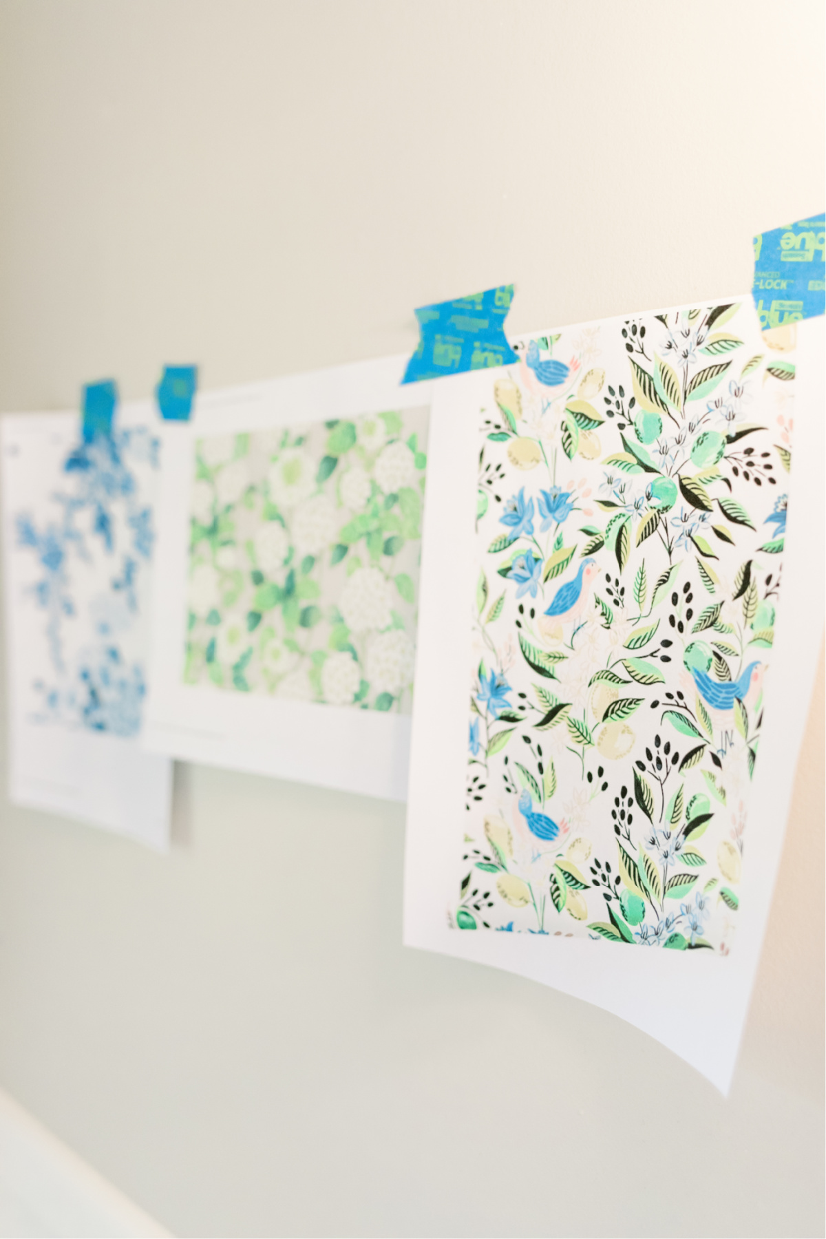
The samples eventually arrived. Pyne Hollyhock was the obvious choice. And, my beloved Hale Navy paint worked beautifully with the paper.
It became the guest bath vanity color.
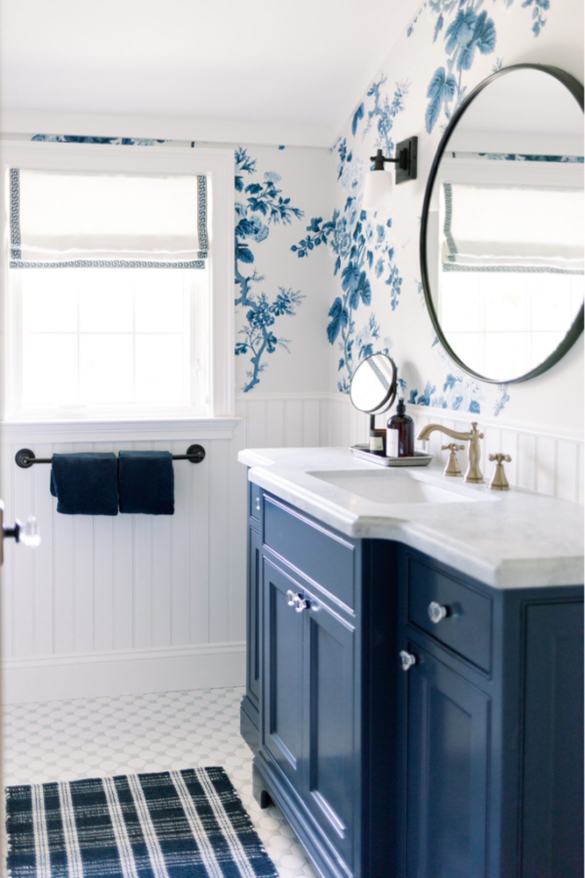
The smallest room in the house is my favorite room in the house.
Important Mention
As discussed in my prior post – Snowberry’s Interior Paint Colors, Part One – we did not buy our paint from Farrow & Ball. Our painting contractor had our paint colors matched and mixed by Benjamin Moore with their Aura base.
Let’s review the paint choices:
- Hallway upper walls – Farrow & Ball Slipper Satin No.2004
- Hallway lower walls – Benjamin Moore White Opulence OC-69
- Master Bedroom walls – Farrow & Ball Slipper Satin No.2004
- Maser Bedroom ceiling – Benjamin Moore White Opulence OC-69
- Master Bathroom/Closet walls & wainscot – Farrow & Ball Strong White No.2001
- Master Bathroom/Closet – base, crown, ceiling – Farrow & Ball All White No.2005
- Master Bathroom vanity – Farrow & Ball Manor House Gray No. 265
- Guest Room #1 walls, ceiling, trim– Farrow & Ball Borrowed Light No. 235
- Guest Room #2 walls, ceiling, trim – Sherwin Williams Sea Salt 6204
- Guest Bathroom – bead board & trim – Benjamin Moore White Opulence OC-69
- Guest Bathroom upper walls – Schumacher Pyne Hollyhock wallpaper in Indigo
- Guest Bathroom vanity – Benjamin Moore Hale Navy HC-154
Paint finishes – Walls & Ceilings (drywall) = flat finish. Moldings & trim = satin finish.
Our cabinetry was painted by our cabinet maker in his shop.
-
- FB Manor House Gray
-
- FB Strong White
-
- FB All White
-
- FB Slipper Satin
-
- FB Borrowed Light
-
- BM Hale Navy
-
- SW Sea Salt
-
- BM White Opulence
And that’s a wrap on Snowberry’s paint colors.
You can see Snowberry’s first room reveal here!
I can’t believe it took three blog posts to cover Snowberry’s color scheme, inside and out. You can read about the exterior design and paint colors here.
And, the interior paint colors part one here.

On a personal note, I made an appearance on The Midlife Fashionista’s blog last week. Do you follow Susan’s blog and Instagram? She’s an incredible style blogger, style consultant and the founder of Uncommon Threads, a non-profit organization offering low-income woman a variety of programs and services to help them look and feel their best. You can learn more about the organization, my decision to become a contributor… as well a few secrets about me on Susan’s blog.
As always, I appreciate your visit and would love to hear your thoughts in the comments below.
Cheers from Snowberry!


Reader Interactions